AccuPOS
AccuPOS
AccuPOS
AccuPOS
AccuPOS
US based AccuPOS needed to re-energize their brand image and completely re-design their marketing site to more effectively communicate their advanced point of sale software and hardware.
US based AccuPOS needed to re-energize their brand image and completely re-design their marketing site to more effectively communicate their advanced point of sale software and hardware.
US based AccuPOS needed to re-energize their brand image and completely re-design their marketing site to more effectively communicate their advanced point of sale software and hardware.
US based AccuPOS needed to re-energize their brand image and completely re-design their marketing site to more effectively communicate their advanced point of sale software and hardware.
US based AccuPOS needed to re-energize their brand image and completely re-design their marketing site to more effectively communicate their advanced point of sale software and hardware.
To comply with my confidentiality agreement I have omitted and appropriated confidential information. These designs are a reinterpretation of the original.
To comply with my confidentiality agreement I have omitted and appropriated confidential information. These designs are a reinterpretation of the original.
To comply with my confidentiality agreement I have omitted and appropriated confidential information. These designs are a reinterpretation of the original.

Project overview
AccuPOS needed to re-invigorate their acclaimed Point of Sale software, and give their personable, fun brand image a modern make-over. Our main challenge however, was rethinking their marketing website to improve signup, better communicate their hardware and software features, and show how their offerings can benefit business owners in an increasingly competitive market.
The challenge
Refresh their visual identity whilst retaining existing brand recognition.
Rethink and Redesign their marketing site from the ground up
Services provided
- Visual Identity
- User experience
- User interface
- Visual design
- Wireframes
- Icon design
Services provided
- Visual Identity
- User experience
- User interface
- Visual design
- Photography
Services provided
- Visual Identity
- User experience
- User interface
- Wireframes
- Visual design
- Icon design
Services provided
- Visual Identity
- User experience
- User interface
- Visual design
- Photography

Branding
AccuPOS already had a large userbase so it was important to retain existing brand recognition. Rather than create a completely new logo, I chose to refresh their existing mark. The overall composition was sound, it was just the treatment of styling that was dated. I cleaned up the design by removing gradients, dropshadows and embossed effects that dated the mark.
Updating the lettering was also an important step in the refresh. I replaced the generic 'system font' style lettering with a more modern yet approachable typface - customising the opening letter 'A' to match that of the logo mark.
From there I distilled the logo further to create a single 'AP' supporting mark for online usage and small hardware application where the full AccuPOS logo would otherwise be illegible.


Content strategy & UX/UI design
AccuPOS has a large marketing site, and it needed an extensive rework of its information architecture in order to create a clear user experience. I worked alongside dedicated content strategist and SEO guru, Andrew Whitford to define target audience personas and user stories. Together, we revised the content strategy across the whole site to improve the flow and simplify a fairly complex product offering, while retaining all key benefits throughout the content.
After re-working the entire sitemap we were able to improve the structure and better highlight key features and develop more concise stories and content copywriting.
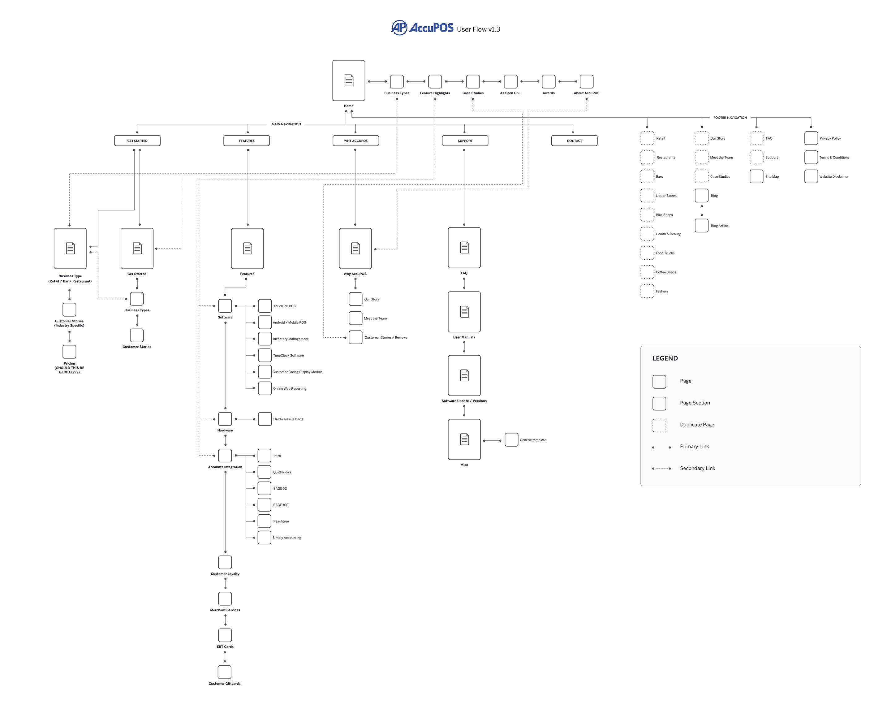
Wireframes for 20+ unique pages
Once the content strategy was clear and approved by the client, I was tasked to create lo and hi-fidelity wireframes for 20+ unique page layouts, making sure every benefits for the software and hardware packages were included. This enabled us to keep track of all business goals for the site and secured us solid approval from the client and stakeholders before moving on to visual designs.

We had our brand look and feel established and our site all mapped out, so visual design was relatively straightforward, because most of the hard work had already been done. I created the pages using a grid system, so the designs easily scaled at different viewport sizes.
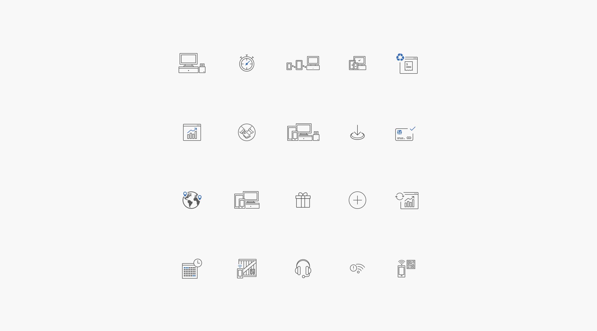
I created a custom set of icons for AccuPOS to identify features and benefits throughout the new website.
We had our brand look and feel established and our site all mapped out, so visual design was relatively straightforward, because most of the hard work had already been done. I created the pages using a grid system, so the designs easily scaled at different viewport sizes.
I created a custom set of icons for AccuPOS to identify features and benefits throughout the new website.


"Mike is wonderfully consistent with communication and never ceases to impress me with his creative talents. Even though he lives in an opposite time zone, he is one of the easiest people to communicate with and I will never hesitate to work with someone across the world because of this experience! I recommend Mike highly to anyone who needs design."
"Mike’s communication skills are second to none, and his UX & UI abilities remain the yard stick I use when hiring potential designers to join Appscore. I highly recommend Mike for any project."
"Mike’s communication skills are second to none, and his UX & UI abilities remain the yard stick I use when hiring potential designers to join Appscore. I highly recommend Mike for any project."
Heather White - Founder, Chief Creative Officer at SeaLab LLC
Benny Sheerin, Technical Director at Appscore
Benny Sheerin, Technical Director at Appscore
Browse more projects

Vizion.aiVisual identity, UI design, Illustration

NutriFitVisual identity, UI Design, User Experience

MonMon PhotographyVisual identity, web design, photography
TramTRACKER®UI Design, iOS

iOfficeVisual identity, app design, illustration

ArchiveNoteworthy snippets & illustrations